Open your phone –> click Instagram, scroll through posts, double tap a few, go to the reels section, doomscroll for an hour –> go back to the homescreen –> click LinkedIn –> get jealous of others successes or look at some cringey posts, again back to home. Open any news app (say, Google News, Twitter, etc.) scroll again there and come back! That’s it! This is our usual form of reading content (or rather ‘consuming’ content)
It was 2 weeks back, that I just randomly came across Volume via a Google Play recommendation. And of course, I found it interesting and downloaded it without giving it a second thought!
Why “Volume”?
Well, I first tried out the app and then went on to do some research about the background and stuff. (The research was nothing but simply visiting their website of these folks and going through some chats on the Discord server!😅)
As far as what I’ve understood, they are trying to disrupt the publishing industry (specifically “the reading part of it”). So, let us restrict ourselves only to “reading” as the content that we mostly consume is either through reading (Social Media, News sources such as Mint, Times of India, Business Standard, etc.) carousels (Instagram / LinkedIn), or videos (YouTube, Reels, Shorts, etc.).
Referring to an article by their CEO on Medium, the whole premise as to why Volume came into existence (or in fact ‘exists’) is because when it comes to “reading”; there has been no ‘groundbreaking’ innovation as such on the way content should be read. Earlier (and even now tbh), we used to read physical books. Later on in 2006-07, e-readers like Kindle came into lime-light, and we started reading digital copies of those same physical books on eye-strain free displays. Further, down the timeline- smartphones, where we read the same news articles from the newspaper; again some read books there too! You see, the ‘reading’ activity as such has relatively remained the same.
Another point in that article which caught my eyes was how we are underutilizing the technology and tools available in our hands and not trying to make reading more “immersive and attractive” (rather than mundane). This is what Volume is attempting to do – “Crafting Immersive Storytelling Experiences” (This was the article’s title actually!)
Coming to the App…
Keeping the above “Immersive” context in mind, let’s move on to the app!
The interface is pretty straight forward – similar to any news app / RSS reader, actually! (create an account and select your news sources, read.); so I won’t waste time getting into the interface.
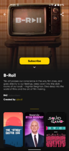
What you might call ‘pages’ on other apps is called a “Stack” on Volume. Each Stack is a creator’s page, basically where you can find all the created posts there!
Stacks of creators (Left); Posts by creators in the stack (Right)
Since, the content has to be immersive; you’ll notice that each of the posts are “story-sized” almost covering the entire screen. Just like a carousel, you can swipe ahead to read the content further and swipe up to move to the next post!
Moreover, there are no “noisy” elements inside the app. No “Stories”, no hashtags, no “reels” (obviously, because it’s a reading platform 😂), no comment sections, no “news” feeds like Google’s ‘Discover’ pane, which would cause distractions. Just pure focus on content.
Of course, you can subscribe to stacks and personalize the kind of content that appears in your feed in the app settings!
One more thing I liked about the app is that in the profile section it shows you what kind of content I’ve read so far in a pie chart!
What about that “Future” in the title?
Currently not accessible to the creators onboarded on the app in general, the app supports posting animated content too on it. There is a separate banner in the app if you scroll down a bit called “Crafted by Volume” which has that what I would call “the future” content! Posts in that section are completely different from the usual stacks available across. On an informal inquiry with one of co-founders (Saurabh Pujari) of the platform, I got to know that the reason why that specific section exists is because, they want to showcase the kind of content that is possible to be created using all the tools available and not all creators would normally be comfortable creating such content! Have a look at 2 samples below-
Also, one thing I noticed in the app that though currently there are very limited creators that publish content here. But, all of their posts are dope! Talk about their content – dope; their formats – dope, their color choices and illustrations in the posts – dope! This really shows that the folks at Volume only want quality content / no-nonsense providers to be onboarded there.
Wrap-Up!
Anyway, I’m now a fan of their platform that they’ve been creating. Volume is now already present right there on my homescreen and I use it daily (Their notifications too are fun sometimes! 😆)
What do y’all think, will Volume be able to achieve its goals? Speaking as of now, the app has already crossed 10K+ installs on android with an average rating of 4.6/5 and is already on No. 22 spot on Apple’s app store in the “Magazines & Newspapers” category. This shows that at least users are already liking it!
Given that they do their quality checks before onboarding any creator and also want to rope in publishing companies to introduce their content on Volume, Will they be able to increase their current count of creators? Only time in well!
You can download Volume from here for free. Available on both android and iOS
Let me know your thoughts in the comments section below!
Don’t forget to check out my previous article on “Expenses Manager” here
Are you aware of any app that you want me to cover for my reviews? Just DM me on Instagram, Twitter or shoot me an email on letsconnect@appsaware.in
Show me your support here
stay aware, stay appy 🙂


0 Comments