The source code (for OEMs to adopt) of the latest version of android was released on 4 Oct ’21 and the update officially rolled out to Pixel devices (OTA) on 19 Oct ’21 (the exact time when Google unveiled its Pixel 6 series!).
Android 5.0 (Lollipop) was a big step Google took by introducing its own Material Design language, which evolved quite a heck lot since then! Fast Forward to 2021- Google basically has doubled down on its Material Design system by giving it a more wobbly, bold and a colorful makeover called “Material You”.
Given the above brief background, let’s dive in deep to see what all is new in this latest release of android (code-name: Snow Cone)
Dynamic Theming
First up is the feature that takes center stage on android 12, set any wallpaper and all the accent colors, all of Google apps (almost, all of them) with adapt to the color of your wallpaper! While this seems dry while reading, below are some screenshots!
PS: One thing is pretty astonishing that how Google was on an update spree since the last 2/3 months to update all of its apps in line with its new ‘Material You’ theming system*. Honestly, this is the same Google where after introducing its own Material design guidelines 7 years back, it took its own sweet time to update its apps to match its own guidelines! I am pretty impressed!
Lock Screen with a big clock!
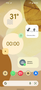
Right when you boot up after the update, you’ll see the lock screen being tweaked a bit (with a big ‘Xperia’ styled clock in the center!) That clock will move to the top-left corner when notifications come up and the transition too is pretty smooth when doing so
Redesigned Quick Settings
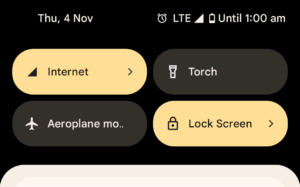
While the notification shade as such is the same functionally, the Quick Settings (QS) tiles have been redesigned to be big very big and squircle shaped! Honestly, I am not a fan of these new tiles (though they look beautiful!) since, on a single pull down-down, only 4 tiles are visible against 6 visible in android 11. Also, these tiles are bigger that what is actually required, hence leading to waste of so much empty space too! (can’t deny they look so beautiful though! :-P)
Privacy indicators and Privacy dashboard
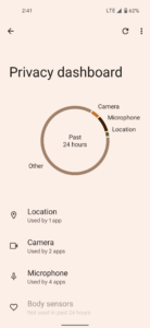
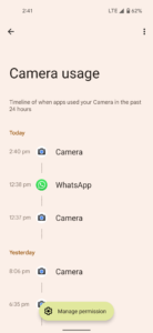
Yes, Google copied this from iOS but has made them ‘functional’ I would say! The indicators appear when some app accesses the camera or the mic. How is it functional? Pull down the QS panel and see that icon there at the top right? clicking that will again show which you which app is accessing the camera/mic + you can tap it again to go into the ‘permissions’ page of that app! Also, android 12 now even comes with a Privacy Dashboard which will display a trail as to when a certain app had used which of the permissions with more options if going deeper!

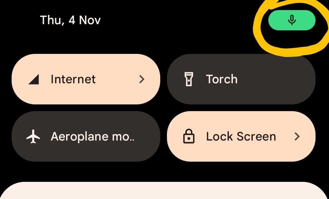

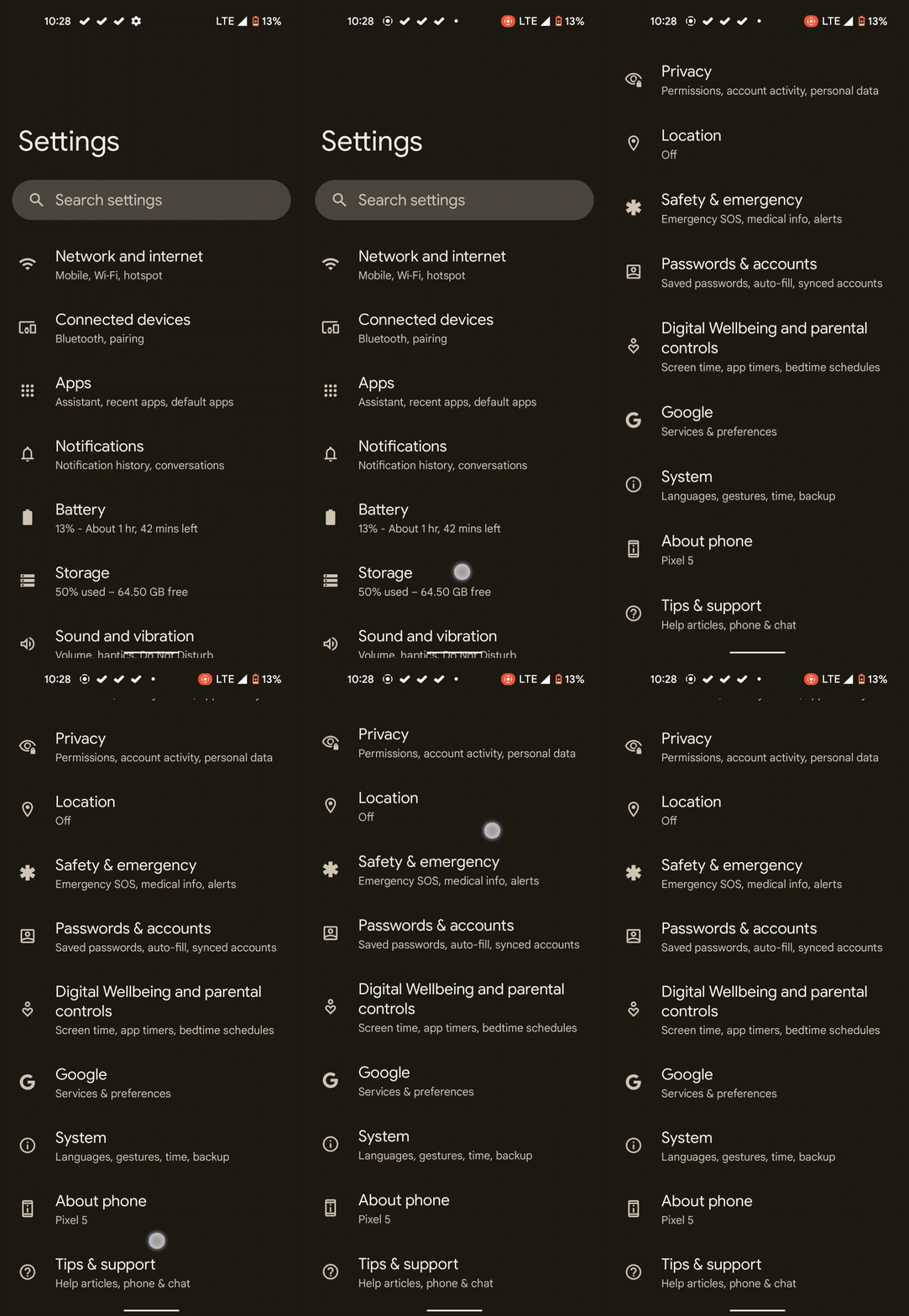
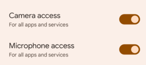
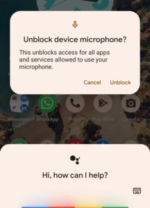
Moreover, there are specific QS tiles to enable/disable camera/mic access system-wide for the ultimate paranoid users! In action below ↓
From Top Left to Right— The QS tiles; Options under Privacy settings; Behavior when app attempts to gain access.
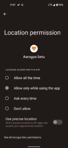
Similar to iOS 14, even android 12 has added options to share either the exact or the approximate location with ability to change it again in the app settings too!
Widgets! (Eh…not new, but refreshed!)
Should I thank Apple for this? Probably, yes! Widgets have been around for more than a decade now on android but while they were functional (I never used much tbh!) but they were not pretty by default! Apple introduced widgets in 2020 in iOS 14 and boom widgets are trending again! Obviously, Google had to up its game that it actually started! Introduced in android 12 are refreshed widgets— from Google Keep, Chrome, Clock, to a new ‘conversations’ widget; each of them have their own style (again consistent with the ‘Material You’ theme!). Plus, by default, each widget will have rounded corners to further match the aesthetic! Sweet!
Left- Clock and Google Keep widget; Middle- Weather, stopwatch, conversations and Chrome Dino (he does not blend in like a chameleon though, yeah ofc! he is a Dino 😢) ; Right – Revamped widget picker
Scrolling Screenshots
Finally…finally! You can now take scrolling screenshots on android now! The implementation is definitely better than what other OEMs implemented (where the screen used to automatically scroll until you stop it!). On Android 12, snap a screenshot, tap the ‘capture more’ option, then you can select exactly the (extended) portion of which you need to take a screenshot!
One-Handed Goodies
So, Google basically copied some features here…it coped the Big header texts from Samsung’s One UI (Though Google has implemented it only in the settings app for reasons unknown). Plus also copied the Reachability feature from iOS and renamed it as a simple ‘One-Handed Mode’ keeping even the trigger as the same – Swipe Down on that Home pill at the bottom!
Gaming Dashboard
As soon as it’s turned on…a ‘controller’ icon appears to the right of the screen, with options to capture screenshots, screen recordings, display the fps counter, optimization (by supported apps), and even activate DND. I don’t play many games, but it’s pretty neat!
An annoyance is the setting, though turned on by default, is pretty hard to find in System settings!
I had to google a bit to find it! – Open Settings > Notifications (Seriously? In notifications?) > Do not Disturb > Schedules > Tap the clog icon next to the Games icon
Such tedious process!


From Top Left to Right- The icons while gaming, Other options, The (not so easily accessible) gaming settings
Revamped Magnification functionalities
Triple tap to zoom as an accessibility feature has been a part of android since the v4.2 (Jelly Bean) days! Eight versions later, these have been revamped to even add additional ways to magnify your screens (Triple tap still exists)!
1. Temporary zoom in — tap the accessibility shortcut, hold anywhere on the screen and just pan around without lifting your finger
2. Zoom and stay — tap the accessibility shortcut, tap anywhere on the screen, explore the area using ‘two fingers’ (Single taps and swipes while magnified will trigger default behaviors!)
3. Add a magnifier on screen — tap the accessibility shortcut, tap the icon in the bottom right corner, use the on-screen magnifier to pan.
All video demos here:
Other tidbits…
Splash Screens (Enforced)
Starting android 12, users will notice app icons being shown briefly while launching an app just before the app actually loads— that’s called a splash screen! While adding splash screens was at the discretion of the developers earlier, android 12 has simply mandated it by a native implementation! Developers are even free to animate these splash screens to match their branding/style
[Note: There is no impact on app launch times with the introduction of this change! (in fact, Google claims that app launch time have been decreased by 22% when compared to android 11, I’ve too experienced this decrease occasionally!)].
I’ve already uploaded a few on my Twitter handle…embedding the tweets below!
Extra dim
This is a new addition which can be accessed both via the accessibility settings and also through by adding a QS tile in the QS panel. What it does basically is dim your screen further (while retaining your current brightness indicator!) In other words, whatever the brightness, if you turn on ‘Extra Dim’, the screen will become a bit dimmer. This is especially useful when using your phone in the dark/night to further reduce strain. Happy Doomscrolling while sleeping 😉
Overscroll animations
Scrolling up and down? Just notice that overscroll as you reach the end (not exactly a bouncy effect, but elements just becoming elongated briefly; to indicate inertia maybe?) Well, that’s all- It’s subtle, but it’s there!
Screen interaction animations
I am not really sure if it’s native to android 12 or Pixel devices specific but yeah! these interaction animations are pretty cool! When keeping your phone to charge, unlocking your phone using the fingerprint reader, pressing the power button to turn the screen on/off, these interactions seem just natural
(Note: the screen on/off animations only work when ‘Always On Display’ is on)
Annoyances
The below 2 annoyances are like really frustrating to me ever since I’ve upgraded my Pixel to android 12. If something is worthy to be mentioned as “annoyances in android 12”- Let these two be given that prestigious spot!!
Seriously, I guess these two are definitely a work of some disgruntled employee of the android’s UX team at Google, which I further guess, his/her seniors didn’t seem to care about these 2 changes in specific!
1. Combined Wi-Fi and internet toggle 🙁
Damn! who does this! It is so cruel to combine the Wi-Fi and Internet tile into a single one which takes another tap to enable/disable either of the two! These are perhaps the most used tile in any smartphone till date. Those extra 2 taps really get on my nerves every single time I use my phone!
There is a workaround to get those independent Wi-Fi and Mobile data tiles back, but I have no idea for how long will this trick work!
2. 😭 No Screen on time since last full charge
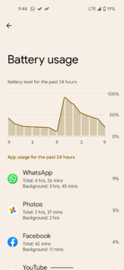
I am a user (and I am definitely not alone) who often visits the devices battery section to check out my phone usage since the last full charge with the screen on time, apps eating up the battery since the last charge, etc. With android 12, Google decided (no one knows why!) to do away with it and the battery usage section now simply shows usage for the last 24hrs with a charge graph at the top! This is usability taken away and complete redundant too! Now I cannot (directly) know how’s the device battery been performing and with the kind of data presented, guess work is too unreasonable! I mean come on, Google; We didn’t need this change, no one ever on earth asked for it BECAUSE THIS USAGE DATA HERE IS READILY AVAILABLE IN THE DIGITAL WELLBEING APP of yours!
Oh Google, My Google, “if it ain’t broke, don’t fix it!”
Phew… Done!
I hope you (most probably on your non-android 12 device) enjoyed reading this write-up of mine!
Do let me know your thoughts on android 12, in the comments section!
Don’t forget to check out some of my previous articles as below-
Siri Shortcuts – The underrated iOS app
[Opinion] The Amazon app – Why does this thing even exist
I even regularly post some of my new findings in many apps (nitpicking, you can call it!) on Twitter! Do follow me there to get some insights there too – twitter.com/prajjwalporwal
stay aware, stay appy 🙂











0 Comments