These kinds of articles require disclaimers, so continuing this trend,
I totally respect and admire Amazon as a company [and all its services ;)]. I even have an Echo Dot! (3rd Gen) and regularly order stuff through Amazon.in.
It is just that I really, really cannot ignore that fact (refer the title) and I wish people become aware about it!
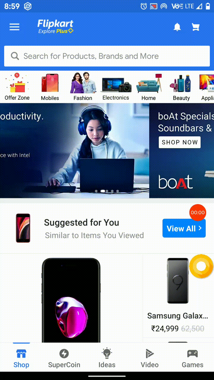
Let me start with screenshots…


Just in case you all are wondering…the first 2 screenshots are of the app, while the next 2 are of the mobile website.
Apart from the gradient, I can’t see any difference really there.
Getting the point? Amazon has, in my opinion, technically done no value-add as such by creating this app in the first place (apart from whopping app install numbers)

I mean seriously, at-least here in India, in the app I can only see 2 visible additional changes in the app over their website:
- The greenish gradient at the top portion on the search bar and on the sidebar
- Ability to use Amazon Pay UPI
Before UPI, even that gradient was absent! Again proving that the app was serving no additional purpose.
There must be genuine reasons for an app to exist in first the place…this app does not have any, IMO. I really have no idea what lead to Amazon to create the app in the first place!
Consider Flipkart, they have turned their mobile-based website into ‘Flipkart LITE’ and their app actually has additional functionality. The bottom bar of the app might explain this well!

An app simply done wrong!
Okay..they have created this app. But there are certain things that are still not done right! – (I wonder what exactly is going on in that App Development and Maintenance department of Amazon Inc.).
Here are a few examples:
The ‘Back’ Story
This can act as a strong reference point of why the Amazon app is just its website copy!
So in the example below, I am in the ‘Orders’ section, and now I open the sidebar and again tap ‘Orders’ and repeat this task thrice. Ideally, when I press ‘Back’ now, I should go to the true ‘previous’ section (from where I started). But no…in a totally browser-based ‘web-paged’ behavior, I am stupidly stuck at the ‘Orders’ section only! Maybe, the app fails at understanding the context (As shown below, the app forgets that I am already in the ‘Orders’ section and loads a new instance of that page again!) – Come on, Amazon…you need to be taught this childish stuff?

[Jenson’s α = Its too negative (apologies for this finance pun, couldn’t control myself!]
Gingerbread Chills!
Open any link to the Amazon app from outside the Android app, and you have this pathetic (from the Android Gingerbread times) gray bar at the top! And it doesn’t open any quicker!

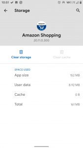
The storage. What for?
Okay, I agree its 2020, almost all smartphone users have at least 32/64 GB of storage in them but still, I am failing to understand for what reason it is occupying 152 MB of space on my phone? (112 MB on iOS)
(For a perspective, Flipkart – whose app is actually justifiable, occupies 126 MB of the space (79 MB on iOS). Also, even apps like Zomato and Swiggy occupy 134 MB and 145 MB of space)


The App advertisements are completely misleading!
There are no swipe features to switch between products in the app (and above is the only one instance, I’ve been seeing similar ‘swipe ads’ probably since 2016 / 2017… I don’t expect such cheapness from a mammoth-like Amazon but, it’s happening…and since years now 🙁
Never, ever I have seen such smooth scrolling in the Amazon app!
One might think that I am cribbing too much… No, I am not!… One cannot simply portray a totally different picture of their app, especially when those functionalities are not available in the app!
Further, it’s really saddening to see such things from a trillion-dollar company!
Lastly, The App does not ‘feel’ like an app!
The most important part of an app is its User Interface / User Experience (UI/UX). Just open the app and use it, it does not have that feel of an app. I mean the other apps – Swiggy, Zomato, Flipkart, and even Amazon’s own Prime Video app! They don’t have that web-browser’y essence.
The design languages are years behind and the whole UI in the app is just not okay! And I don’t know who even thought that adding some gradient to the search bar in the app is a great idea.
The app simply does not have that visual appeal.
“The app is just a 150 MB sized web browser that loads nothing but Amazon.com”
I wonder why the Amazon app has never been built from the ground-up, at least to match Prime Video!
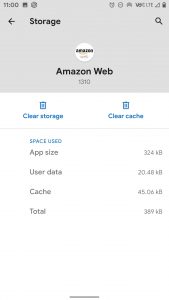
Sincere Tip – Just add the Chrome Shortcut for Amazon Web
Unless you use Amazon Pay UPI, I don’t think there is any strong reason to keep a web-page downloaded from Google Play, the ‘Amazon Web’ web-app is more efficient!
I won’t leave any download links this time, But I’ll just leave a super-small tutorial about ‘how to add a website to your homescreen’ (similar process for iOS too)


It is faster than downloading the app!
With that being said, I really think Amazon needs to consider a rejig of its app. I first started using Amazon in 2015, since then I only get to see that same old web-page!
Let me know in the comments section about what do you all think!
stay aware, stay appy 🙂


0 Comments