Swiggy founded in 2014, Zomato in 2008; yet what’s making this younger kido practically the only and toughest competitor to the big guy? This may not be wholly true, but the USER EXPERIENCE (UX) has indeed played an important role in its success (you know, that’s why I want to write this article). Even, Zomato aware of this has very well stepped up its game app when it comes to UX and is not lagging behind. Let’s hop on and start this showdown; It’s Swiggy vs Zomato time!
Focus
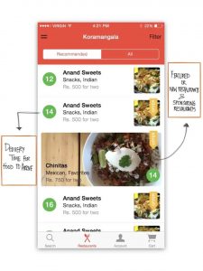
Plainly seeing, when it comes to searching for restaurants, Zomato is the one and only choice coming into our minds and yes Zomato was initially meant for it. Have a look:
Source: makeuseof.com
In March 2015, Zomato also introduced online food delivery services, almost the same time when Swiggy’s app landed. Now, Zomato’s focus is as follows (at least the first focus)
Doesn’t seem obvious that things have changed?
Anyway, point is, Zomato has changed priorities while restaurant finding is still there but not the primary focus now.
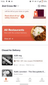
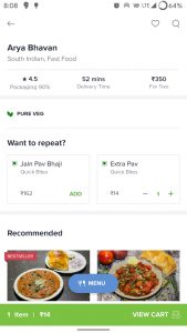
Coming to Swiggy, since inception their app is only into one thing – food delivery.
Swiggy back then (Source: obvious.in); and now (Right)
Well, this is what it is. Nothing much can be done about it; Entirely their own call
The App
The app being the core for both of these services’ existence, let’s have a look at how they stand against each other!
Swiggy
All in all, Swiggy’s app is perfect with nothing much going on in the app. You open it and you are greeted with restaurants around your selected location. You tap it, add your food to the cart, pay and track the order.
Keeping things simple, surely has its advantages – the app is very breezy to use, things just fly-by with the simple animations, and it’s neat and clean design (everything be it the fonts, colors and button placements and animations, iconography, etc.)
What I like?
Material Design – Just the sufficient and relevant bottom bars, flat cards, the FAB (Floating Action Button) ‘menu’ while inside a restaurant (not literally, please!). Even Zomato has these bottom bars but Swiggy’s implementation looks way neater.
The ‘Account’ section (this is my favorite) – The ‘Account’ section is perhaps what I’ve liked the most in the app. I mean, it is really systematic and clean with categories at the top and all your orders just right there below (keep scrolling and have fun) with big buttons that dynamically change depending on whether the order is in-progress or delivered. Recently, they introduced customer ratings in the app and damn, those ‘Star’ characters and various icons for portions, delivery, etc., while giving feedbacks and ratings are really adorable. Makes me give feedback each and every time I’m done ordering.

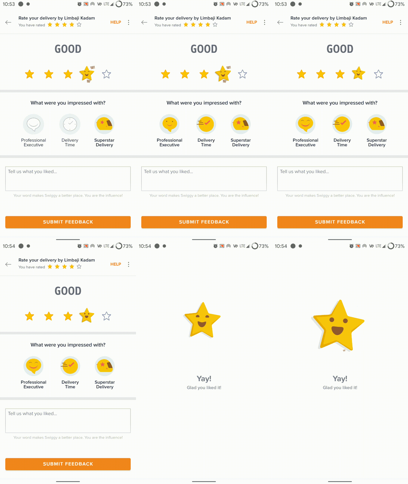
Picture in Picture (PiP) mode (Android only): First introduced in Android 8.0, and until now, not many apps have fully utilized this capability, and I’m really glad to see this being implemented in the app. I mean, tracking your food while doing some other work is really a thing.
Hmm… Swiggy’s way of showing that indeed; food is important whatever you’re working on!
Do your thing while tracking your food, foodie!
What I didn’t like?
The ‘Search’ bottom bar – Really, this wasn’t needed when comparing with Zomato (which has a universal search bar present there), I really like the idea for searching for cuisines irrespective of where you are in the app. While there is another argument, that with phones getting taller, bottom bars are need of the hour, so let it stay there, on which I would advise, add a universal search at the bottom!
Zomato
With Swiggy following a much focused approach, we have Zomato following a more concentric approach. So what all we have here?
- The restaurant finder for your dining needs
- Online food delivery
- A Google Local Guides like crowdsourced review platform specifically for foodies
- Zomato’s own video streaming platform
Well, Zomato, recently had a UI overhaul in 2020 beginning where in-restaurants views were drastically changed. Well, I was impressed with those stacked cards categorized into ‘Order online’, ‘Book a table’ and ‘More info’ followed by menus and reviews. To be honest, previously without this organization, everything felt haphazard!
Also, with the new update navigating within the app has been zippier than before which I really appreciate!
Again, What I like?
Very well organized – Open the Zomato app, and you’ll be overwhelmed, a lot is going on here (the 5 things mentioned above), take a brief pause and look again, everything is properly categorized, the surrounding restaurants, top brands around you, same for all other tabs and even the Videos.
Universal Search bar – Well, thanks to Swiggy for making me realize that this thing is actually useful. The ball is in your court now, Swiggy!

Review analytics – With the combination of people ordering food, taking people onboard to publish their own reviews and as bloggers, Zomato has successfully implemented review analytics – say, what people order the most, identifying and categorizing reviews as tags for easy reference and also on an overall basis defining the restaurant, is really noteworthy; Not to ignore, these ratings have indeed become a benchmark to pick restaurants.
Again, What I didn’t like?
Swiggy has me all over, over these,
No PiP mode – This is really a useful feature and having ordered food from Zomato, absence of this feature really pricks me.
The ‘Account’ section – Press your profile pic at the top right and – floods… everything is expanded…well nothing to worry about but coming from Swiggy it is really a bummer for me.
That ‘location’ overlay – So, I am not the person who always keeps location scanning on 24/7, and this thing in Zomato really irritates me. Open the app and it every time gives you an overlay to update the location each and every time, with the only option to update it manually or enable location (and a very small ‘x’ button at the top right).
“Zomato!, I do not want to change my ordering location each and every time I open the app, let me be free and remove it!”
There’s no way round other than stretching your finger all the way to the top!
Well to conclude, overall a good job Zomato, perfectly managing so many things without hampering (but improving) the UX!
APPEAL TO BOTH
Come on both of you, it’s 2020 and still there is not even a single sign of Dark Mode coming to these apps, I thought you two would be among the first to bring it!
Some misc. stuff
Was just exploring both the websites and their ‘Focus’ed approach is outright visible there too (No more screenshots, go look for yourself)Additionally, I noted some other interesting things too
Both of these blogs focus on the other side of their universe – the companies, cultures and even technology. Being biased, I read their tech sections and seriously, reading those shows that they’ve put in and in fact continue to put in a lot of effort by giving a deep dive. For instance – What actually goes into estimating deliveries or Improving app loading times
Let’s end it here!
I had a lot more to discuss (comments section will be the place, I guess) but will take no more of everyone’s time, So why this comparison?, Well I would reiterate that appsaware is not only about identifying untouched apps, it’s even about making readers aware about what’s going on with the existing apps, even they deserve recognition for the improvements they bring in based on feedback; and the devs of these two – their effort is really commendable!
The comments section is open for discussion. Shoot!
stay aware, stay appy 🙂






6 Comments
Unknown · April 4, 2020 at 3:04 pm
👍👍👍
Prajjwal P. · April 7, 2020 at 9:40 pm
Thanks!!!
Unknown · April 4, 2020 at 3:24 pm
Very well written!!
Prajjwal P. · April 7, 2020 at 9:41 pm
Thanks a lot, there’s more to come! 😉
Unknown · April 7, 2020 at 7:17 am
Admire your efforts and good work put into the analysis of the food delivery/restaurant service apps!!
Prajjwal P. · April 7, 2020 at 9:41 pm
Thank you very much for the feedback!