CRED’s been in the news for quite a time now – $2.2bio valuation, The infamous meme’able Rahul Dravid ad, 100% Cashbacks on bill payments in IPL and also during the French Open and Wimbledon!
But there hasn’t been any much talking about its “app” per se – I found these 2 articles via a simple google search:
1. Why CRED has an In-cred-ible design
2. What makes CRED a stunningly designed app? The secret to building inspiring products revealed
Like, what is CRED? – CRED is primarily a credit card bill payment platform that rewards its members for clearing their credit card bills on time. CRED members get access to exclusive rewards and experiences from premier brands upon clearing their credit card bills on CRED. (Source: cred.club)
And how do users need to access it? – not through the website, not through some intermediary, but just the app!
Okay, there are other platforms too, that are “app only” such as Google Pay, PhonePe, etc. but there is a difference…
Difference in the sense that “CRED realizes that it’s platform is ‘app only’ and completely doubles down on it to build an inclusive experience!“.
Let’s see how this is being achieved (actually, this exactly is the objective of my article, in a nutshell!)
1. a beautiful app
yeah, many might have seen this coming that obviously I’ll be talking about it as it’s my personal favourite topic!
First, you’re greeted by this striking splash screen. (I hope their developers are aware of these upcoming splash screen APIs in Android 12).
Next is the dashboard where these days instead of some offers or a banner to “pay that damn Bill”, articles from Finshots are being prominently shown, along-with some gist of your previous rewards, suggestions for referrals and of course, a banner to pay your credit card bills;
then there are other sections named “cards” – where one can pay bills /pay extra amounts, get all sorts of insights on your credit card such as spendings, offers available, customize auto-payments, reminders, etc; and “money” – where you can check your Bank a/c balance (through UPI), credit score and even avail an instant loan. I’ll come to the “club” section later!
If you navigate to all these, you’ll see there are many animations /transitions in place from subtle to intense, even gestures at place! Actually, CRED has adopted this design language called “Neumorphism” – which implies bringing depth, shadows and lights to the interface elements (here, the app). You’ll notice that CRED has adopted it front and centre – just notice those buttons at various places (both before and during clicking them), the depths and shadows between each element (banners, tabs, buttons, etc.). All this is aimed to create a more real life-like experience which many of the people would appreciate. I especially liked the subtle haptic feedback when any button is tapped in the app (just turn on the touch vibrations /haptics from your smartphone settings and experience it for yourself!)
In fact, just 6/7 months earlier, CRED even made their deign adaptation Open-source, for everyone to view the code that went into the giving their app the Neumorphic touch! You can access it here. Their more of the design portfolio and experiments are even present on Dribble
As you can see below, the following transition is from the latest update which the app received. They’ve added this sort of ‘quick access’ button in the centre with various tiles to perform quick actions. To be honest, I strongly feel that control centre sort of thing is really redundant – Given that a controls section is already present in the top right corner.
Keeping this argument aside, I personally really liked the way the design mafia is pushing its limits and experimenting these kinds of interfaces which were only plain concepts that designers used to show off (until now) (some concept examples – 1, 2, 3, 4)

source: github
2. premium touches
CRED is an app usable only by its ‘members’. By members, they mean people having a credit score of “750 or above”. That’s it! CRED really played well here by creating a (virtual) garden where only these limited people can enter.
When I first downloaded CRED, because I had recently applied for a credit card, and obviously I didn’t have a credit score and I was not permitted to use that, it was only after payment of 2/3 monthly bills that my score got updated, and I got entry into that (so-called) walled garden.
The very first moment when I used the app, it was all striking – a complete Dark theme, with copper coloured banners here and there, that Neumorphic theming, those shiny but premium looking buttons; Every single thing in this app made me that feel that I’ve finally arrived somewhere, a felling that, that 2/3 month wait was so worth it!
You see, this is how CRED is wooing its users –
1. Letting the user know that it’s a walled garden (member only)
2. Assuring the user that the wait (if, applicable) will be completely worth it!
3. The wait indeed turns out to be worth it due to the very app that the folks at CRED have created.
4. The CRED Club UX (That’s what we are discussing next!)
3. the CRED club
head on to the last tab in the bottom bar in the app – “club”
This is the place where members can utilize their CRED coins (earned by paying Credit card bills) to get price-cuts on various products (you have to purchase it through the CRED app only!)
and someone please tell me, How much ₹ does 1 CRED coin exactly equals?? :/
Hell! I am unable to decipher any pattern
Redeeming 1000 coins to get a discount ₹200 (Left), Redeeming 1000 coins to get a discount ₹4,300 (Right)
Just sift through the ‘store’ section, look at the products being offered, the product descriptions and finally the overall look experience of surfing that section. I personally feel that I am in some luxurious zone and being offered some personal curated products there (though that’s exactly the case!). Most of the products on offer are niche products from boutique brands. Further, super-simple products have been given a description that will put you in awe! – almost at the stage of just redeeming your coins and buying that product because damn…the presentation deserves applauds!!!


Right: Look at that, that’s just a tea/coffee cup made from wheat straw!
Also, take a look at the ‘travel’ section too – here hotel bookings are being offered and just look at the descriptions and stuff… it’s so enticing!
marketing and presentation skills at their finesse…!
quirks
(these are completely from my personal experience from what I’ve observed from using the app…)
no doubt, the app has a pleasant UX, but I still think that it becomes overwhelming at times. Let me explain…
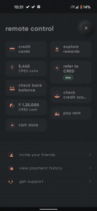
1. the ‘controls’ section is not as efficient as it seems:
Options such as credit cards, explore rewards, check balance, CRED cash need not be present there as they are anyway easily accessible with same or less number of taps though under different sections of the app (yep “no. of taps” is a performance metric!)
Also, given that CRED has introduced this control center kind of a center button in its latest update, I think this controls section may get retired soon as both have some options in common… also this new control center is kinda fun to access! 🙂
2. duplication at places
a. the ‘profile’ section
have a look for yourself… these are banners / information that is available in the respective sections of the app itself!
Okay… if giving the user, a unified view of everything is the aim then remove these from the respective sections and completely bake those banners/functionalities here. This unnecessarily looks cluttered and/or creates confusion, too!
b. the ‘cards’ section
same options accessible from different locations (inside the ‘cards’ section itself!)
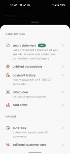
the ‘manage’ button under ‘my cards’ section again has some portion of the options already visible under the ‘manage ‘section. I agree to the point of easy access to things, but there can be another argument of avoiding duplication at-least!
3. how about a light theme?
okay….CRED has explicitly mentioned here that it’s app will have only a dark-only mode, due to their reason of 9/10 members preferring dark mode only. I seriously feel a light mode would be a welcome addition to the app! (after all, the app is not completely dark; have a look below!)
4. this is pure r/mildlyinfuriating material
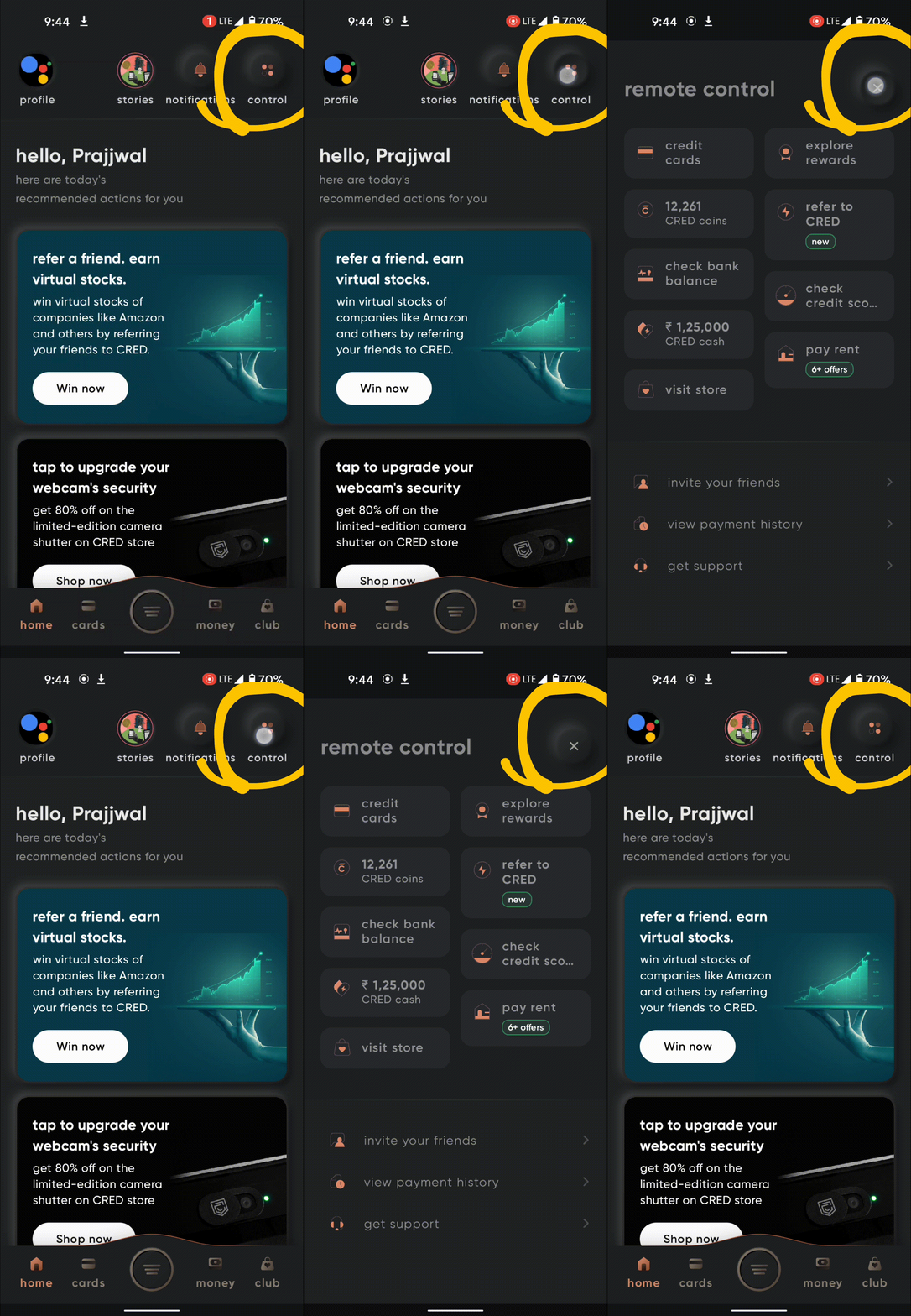
just look at the top right “controls” button position before and after clicking…
to conclude…
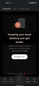
with the above discussion, one thing I can conveniently conclude – CRED genuinely wants and aims to make its users spend more time in the app! It simply shows in the implementation – from onboarding to being aboard, the premium feel, the CRED club with it’s not so popular niche range of partners, the way of communicating simply-simple things in a way that makes the user feel that someone cares about you; all these things just add up! Check these 2 examples below:
Additionally, just check out the following sections in the app for yourself:; CRED Cash, CRED protect, etc (you’ll understand what I mean!). To be honest, rather than declaring these as wrong or not right, these are some great lessons to take away as to how to acquire and successfully retain customers members. In fact, even enticing newbies to join!
Subject to the quirks above, I am really in awe with the CRED app. The kind of platform they’ve managed to created is really praiseworthy – showing you or spends in easy to understand categories, some broad level analysis off what kind of transactions you do on your card.
oh, by the way; here are some fun facts:
1. CRED’S main office too is located in Indiranagar!
2. Turn off your mobile internet / Wi-Fi and the open CRED. You’re welcome !!
So, the CRED app is free to download on both android and iOS (your mileage may vary depending on your credit score, though 🙂 )
let me know your thoughts on my take on CRED in the comments section
do share it with others and follow us on Instagram, Twitter and LinkedIn
stay aware, stay appy 🙂
Read my other articles:
Gboard Emoji Kitchen – Emojis are infinite now!
SMS Organizer – The Perfect SMS app!
**just before someone starts pointing out in the comments section that I’ve not capitalized the first word of the paragraphs / sentences at various places – that’s just an adaptation from the typography adopted by CRED (you can check out their website / app), this is to just make team CRED feel at home – if someone from there is reading this ;)











0 Comments